Bay Area Traffic is Up to 52% of Normal, According to Our New Tracker
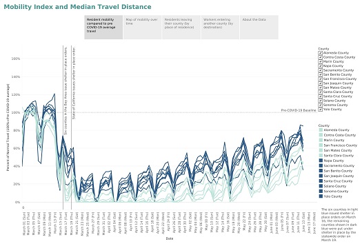
Once the source of epic traffic jams, new data-visualization shows travel between Silicon Valley and San Francisco is lagging in recovery compared to other parts of the Bay Area. While travel from Contra Costa and Alameda counties is on average about 55% of pre-COVID levels, travel from Santa Clara County to San Francisco over the past two weeks is a significantly lower average of about a third of normal levels. Overall, Bay Area residents and workers are traveling further and farther as shelter-in-place orders imposed to stop the spread of COVID-19 slowly lift, according to a first-of-its-kind, regional data-visualization tool developed by the Bay Area Council Economic Institute.
The tool shows which counties are seeing the biggest spikes in travel and where residents and commuters are leaving from and where they’re heading. It also highlights dramatic differences in travel between counties that were the first to impose shelter-in-place restrictions and counties that came later under the state’s shelter-in-place orders.
Regionwide, travel and potentially the economy are recovering. On March 23, travel in the nine counties was approximately 10 percent of normal. As of Friday, June 12, travel averaged across the nine counties and adjusted for population, was up to 52 percent of pre-COVID levels.
View the shelter-in-place data visualization tool>>
Sonoma County residents are returning to the road in the biggest numbers, with travel reaching 84 percent of pre-COVID levels as of June 12. Travel among Santa Clara County residents returned to 39 percent of pre-COVID levels as of June 12, while San Francisco was lowest at 33 percent of pre-COVID travel and Alameda County was at 43 percent. Travel patterns have changed too. While peak travel used to be on Wednesdays in the Bay Area, due to work from home, travel generally spikes to the highest on Fridays and Saturdays, suggesting residents are starting to strike out on weekends after months of shelter-in-place restrictions.
Using anonymous and aggregated data from personal cell phones, the tool offers daily updates from 14 counties stretching from the Bay Area to Sacramento and the San Joaquin Valley. As shelter-in-place orders continue to life, it can track progress towards full economic recovery providing public officials real-time data to help guide in reopening transit and other vital services.
“Being able to identify where travel is heaviest and how its changing over time can provide important information to guide the economic recovery and planning as restrictions lift,” said Jeff Bellisario, Executive Director of the Bay Area Council Economic Institute. “This information can also be used to draw connections between where travel is increasing and where future COVID hot spots might emerge, and providing public health officials timely signals about where it may be necessary to deploy medical resources or consider the need for any restrictions.”

Currently, the tool shows how travel habits dramatically changed following both local and state shelter-in-place orders, where travel declined and where it was slower to drop. For example, the tool shows differences among counties in how travel distances dropped following shelter-in-place orders announced first by six Bay Area counties and then later by the state of California.
Beyond its public health value, the data can also help public officials develop strategies for reopening local and regional transportation systems as the COVID-19 threat subsides and determining the impact of the current lockdown on different parts of the workforce and economy.
The raw data used to create the mapping comes from Descartes Labs, which collects anonymous data from a sample of mobile devices reporting their location throughout the day, then calculates the maximum distance moved from the first reported location. The information is de-identified, aggregated, and summarized to protect the privacy of users and communities.


